In today’s construction and interior design industry, WPC (Wood Plastic Composite) wall panels have become increasingly popular due to their durability, moisture resistance, environmental friendliness, and ease of installation. However, beyond performance, color selection plays a critical role in the success of any project — whether residential, commercial, or industrial.
Choosing the right WPC wall panel color isn’t just about picking a favorite hue. It involves understanding the project’s aesthetic goals, functional needs, lighting conditions, architectural style, target market, and even cultural preferences. In this article, we’ll guide you through the key factors to consider when selecting the best WPC wall panel color for your space or business.
Understand the Purpose and Setting of the Space
Before choosing a WPC wall panel color, determine where the panels will be used. Different settings require different tones and textures to create the desired ambiance:
● Residential Spaces:
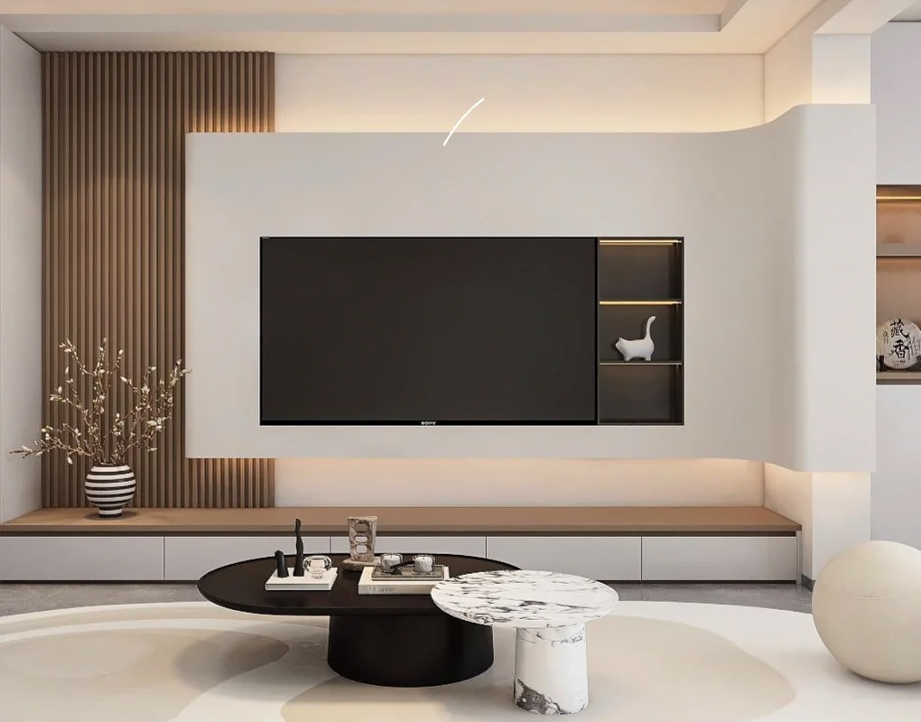
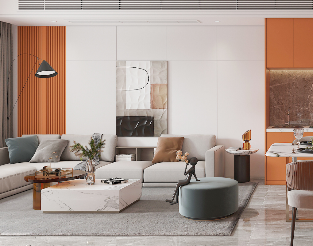
For homes, colors tend to reflect warmth, comfort, and personality. Neutral tones such as light oak, creamy white, or walnut brown are often popular in living rooms and bedrooms. These shades create a calm and cozy environment.
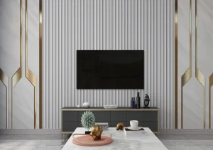
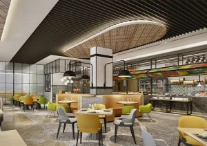
● Commercial Interiors:
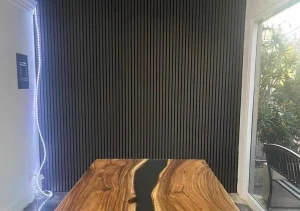
Restaurants, hotels, and offices often go for more modern and sophisticated looks. For example, charcoal gray, slate black, or stone textures give a sense of professionalism and elegance.
● Industrial Applications:
Factories or workshops may opt for darker or more neutral tones that are easy to maintain and don’t show dirt easily — such as graphite, concrete gray, or industrial beige.
● Outdoor Use (if applicable):
For exterior cladding, choose colors that complement natural elements like trees, sky, or stone. Teak, cedar, and weathered wood tones blend beautifully with outdoor surroundings.
Consider the Lighting Conditions
Lighting has a major influence on how a WPC wall panel color appears. The same color can look completely different under warm indoor lighting versus cool daylight.
● Natural Light:
In rooms with ample natural light, you have more flexibility with darker shades like espresso brown or navy gray, which can add depth without making the room feel too dark.
● Artificial Light:
For spaces with limited sunlight, use lighter shades such as ash white, beige, or light maple to make the room feel brighter and more open.
Also consider the type of artificial lighting:
- Warm light (yellow tone) enhances earth tones.
- Cool light (blue tone) pairs well with whites, grays, and minimalist designs.
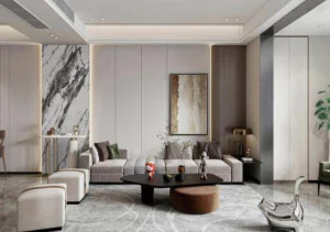
Match with Interior Design Style
Different interior design styles call for specific color palettes. Let’s explore how WPC wall panel colors can complement the most common styles:
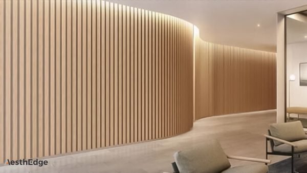
● Modern Minimalist:
Go with monochromatic tones like white, gray, or black. Smooth finishes or matte textures work well in creating clean, uncluttered lines.
● Scandinavian:
Choose light wood tones such as pine, birch, or white oak. Pair them with neutral white walls and soft furnishings for a cozy yet airy feel.
● Industrial Loft:
Go for dark and raw finishes like rust brown, weathered gray, or concrete. Combine with exposed pipes and bricks for a rugged look.
● Traditional Classic:
Opt for warm tones such as walnut, cherry, or dark oak. Ornamental textures or carved patterns can add elegance.
● Asian Zen or Japanese:
Natural wood colors like bamboo, light walnut, and earthy beige create harmony and calmness.
Coordinate with Flooring and Furniture
Your WPC wall panels should not clash with other fixed elements in the space such as floors, ceilings, and furniture.
- Same Tone Match: Choose wall panels in the same tone family as the flooring for a cohesive and continuous look.
- Contrast Strategy: Use contrasting colors to create visual interest. For example, light wall panels with dark flooring can create a bold statement.
- Accent Panels: In some rooms, using a darker or richer tone on one feature wall can serve as a focal point.
Keep in mind material texture also plays a role. For example, a high-gloss panel might pair better with sleek modern furniture, while a matte wood grain panel fits rustic interiors.
Analyze Market Trends and Buyer Preferences
If you’re a distributor or wholesaler, understanding current market trends is essential when choosing WPC wall panel colors to stock or showcase in your catalogs.
● 2025 Color Trends:
Based on recent interior design reports, the trending WPC wall panel colors for 2025 include:
- Smoky Gray
- Natural Oak
- Ivory White
- Desert Sand
- Matte Black
These tones reflect growing demand for eco-conscious, neutral, and earth-inspired palettes.
● Regional Differences:
Color preference can vary by market:
- Europe tends to favor cool and neutral tones such as gray, ash, and slate.
- The Middle East may prefer richer, warmer colors like walnut, mahogany, or golden oak.
- Southeast Asia often leans toward light, natural tones due to humid climates.
Understanding your clients’ culture and climate is critical when recommending or importing WPC wall panels.
Think Long-Term Maintenance and Durability
From a practical point of view, color also affects how easy it is to maintain the panels over time.
- Dark Colors: Hide dirt, scuffs, and fingerprints well, but may show dust more easily. Best for high-traffic areas.
- Light Colors: Show stains more easily but give an open and clean feeling. Best for bedrooms or low-traffic areas.
- Textured Panels: Wood grain textures or embossed surfaces are more forgiving of scratches and wear compared to smooth or glossy panels.
Explore Customized Color Options from the Manufacturer
For large commercial or wholesale projects, it may be worthwhile to request customized color matching. Many WPC manufacturers — especially in China — offer OEM/ODM services to produce specific shades or patterns based on client requests.
Tips:
- Provide color swatches or reference images (e.g., Pantone colors).
- Discuss MOQs (Minimum Order Quantities) for custom colors.
- Confirm sample approval before mass production.
- Request UV resistance or anti-fade treatment if the panels are exposed to sunlight.
This flexibility can be a competitive advantage in the B2B market.
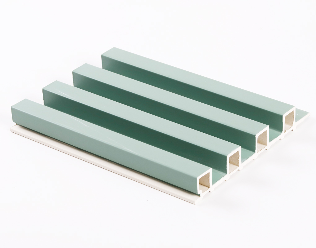
Consider Texture and Finish Alongside Color
Color doesn’t exist in a vacuum — surface texture and finish greatly affect how a color is perceived:
| Finish Type | Description | Recommended Use |
|---|---|---|
| Matte | Soft and low-sheen | Modern interiors, minimalist homes |
| Glossy | Reflective and shiny | Commercial spaces, luxury residential settings |
| Embossed/3D | Textured surface with depth | Accent walls, feature panels |
| Wood Grain Print | Mimics real wood texture visually | All-purpose; suits natural themes |
| Brushed Finish | Subtle lines that diffuse reflection | Elegant or contemporary interiors |
Always test samples under real lighting conditions to see how texture affects the final appearance.
Conclusion: Choose Colors Strategically, Not Emotionally
Color selection is a strategic decision, especially in commercial or wholesale applications. A well-chosen WPC wall panel color can elevate the mood, improve user experience, and even enhance resale value. On the other hand, poor color decisions can result in costly remodels, unsold stock, or dissatisfied customers.
As a rule of thumb:
- Understand your project goals and user preferences
- Match the color to the environment and style
- Test with lighting and real samples
- Stay up to date with market trends and local preferences
- Use manufacturer resources for customization and advice
If you’re working with a Chinese WPC wall panel manufacturer like us, we offer free color consultation, sample customization, and fast bulk production services to meet your project needs. Contact us today to get professional suggestions and free color samples tailored to your market.
📩 Want to receive a full WPC color catalog and free quote?
👉 [Contact Our Factory Now] – Let’s bring your vision to life with the perfect color and texture combination.