WPC (Wood Plastic Composite) wall panels have become an increasingly popular choice for residential, commercial, and industrial applications due to their durability, moisture resistance, and aesthetic versatility. However, choosing the right color is crucial to achieving the desired ambiance, style, and functionality in a space.
This article provides a comprehensive guide on how to select the perfect WPC wall panel color, ensuring a harmonious and visually appealing environment.

1.The Importance of Choosing the Right WPC Wall Panel Color
The color of your WPC wall panels plays a key role in:
- Enhancing Aesthetic Appeal: Sets the overall tone and style of a space.
- Creating Mood and Atmosphere: Colors influence emotions and feelings.
- Complementing Interior Design: Ensures cohesion with flooring, furniture, and ceilings.
- Improving Functionality: Certain colors work better in specific environments.
- Maintaining Long-Term Usability: Neutral colors offer timeless appeal, while trendy shades may become outdated.
2.Understanding WPC Wall Panel Color Categories
WPC wall panels are available in a variety of colors and finishes to suit different interior and exterior styles. The most common categories include:
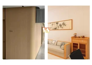
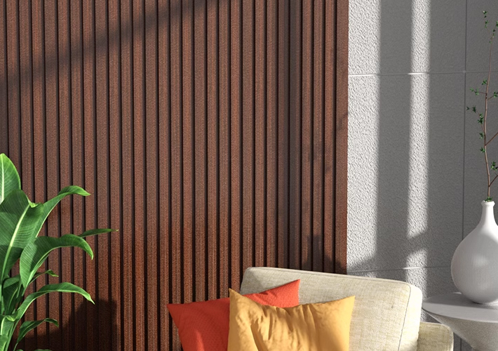
2.1 Natural Wood Tones
Ideal for traditional and warm aesthetics, wood-inspired colors provide a natural and cozy ambiance.
- Oak – Light and fresh, suitable for Scandinavian and minimalist designs.
- Teak – Rich and warm, ideal for both modern and traditional spaces.
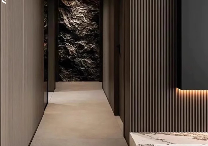
- Walnut – Deep brown with elegant grain patterns, creating a luxurious feel.
- Pine – Light yellowish wood, perfect for bright and airy rooms.
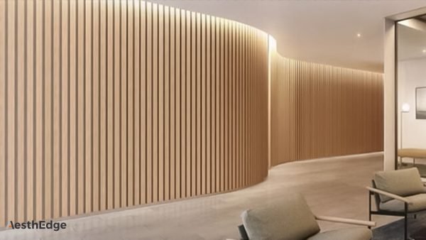
2.2 Modern Neutral Colors
Neutral shades are versatile and fit well in both residential and commercial environments.
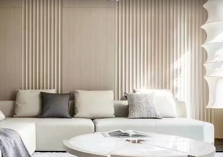
- White – Clean, fresh, and brightens up small spaces.
- Beige – Soft and warm, offering a cozy yet modern look.
- Gray – Sophisticated and contemporary, often used in industrial and minimalist designs.
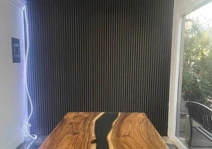
- Black – Bold and striking, creating a dramatic high-end effect.
2.3 Bold and Statement Colors
For a unique and striking design, some prefer bold colors that make a statement.
- Deep Blue – Adds richness and depth, ideal for accent walls.
- Emerald Green – Evokes a natural, refreshing feel.
- Terracotta Red – Warm and earthy, perfect for rustic interiors.
2.4 Stone and Marble Finishes
These designs mimic natural stone textures and are ideal for both modern and classic interiors.
- White Marble – Elegant and luxurious.
- Black Granite – Adds a bold, premium feel.
- Sandstone – Perfect for achieving a Mediterranean aesthetic.
3.Factors to Consider When Choosing WPC Wall Panel Colors
3.1 The Function of the Space
Different rooms and applications require different colors. Here’s a breakdown:
Indoor Use
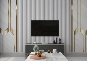
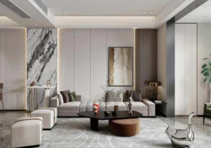
- Living Rooms → Neutral tones (beige, gray, walnut) create a welcoming atmosphere.
- Bedrooms → Soft, calming colors (light gray, pastel shades) promote relaxation.
- Kitchens & Dining Areas → Bright and clean colors (white, oak) enhance hygiene and space perception.
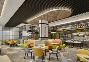
- Offices → Professional colors (dark brown, black, gray) improve focus and sophistication.
Outdoor Use
- Building Facades → Darker colors (charcoal gray, deep brown) resist weathering better.
- Balconies & Patios → Light wood tones (oak, teak) create a natural outdoor retreat.
- Garden Walls & Fences → Earthy tones (walnut, coffee, stone gray) blend with nature.
3.2 Influence of Lighting Conditions
Lighting affects how colors appear:
- Bright Natural Light → Darker colors work well without making the space feel small.
- Dim or Artificial Light → Lighter shades prevent the room from feeling too enclosed.
- Warm Lighting (Yellowish Hue) → Enhances wood tones and cozy aesthetics.
- Cool Lighting (Bluish Hue) → Complements modern grays and neutral tones.
Tip: Always test color samples in your space under different lighting conditions before making a final decision.
3.3 Coordination with Existing Interior Design
Your WPC wall panel color should complement other design elements:
| Element | Color Coordination Tip |
|---|---|
| Flooring | Contrast dark panels with light floors, and vice versa. |
| Furniture | Match or complement panel colors for a balanced look. |
| Ceiling | Lighter panels help create an open, airy space. |
| Curtains & Textiles | Neutral walls work with bold fabrics; bold walls require softer textiles. |
3.4 Psychological Impact of Colors
Color psychology plays an important role in mood and emotions:
- White & Beige → Clean, spacious, and calming.
- Gray & Black → Modern, sophisticated, and stylish.
- Brown & Wood Tones → Warm, natural, and inviting.
- Blue & Green → Refreshing, peaceful, and harmonious.
- Red & Orange → Energizing, warm, and bold.
For commercial spaces, gray and black add a professional touch, while wood tones create warmth and trustworthiness.
4.Current Trends in WPC Wall Panel Colors
4.1 Indoor Trends
- Greige (Gray + Beige) → Modern, elegant, and highly versatile.
- Natural Oak & Teak → A timeless choice for warmth.
- Matte Black → A bold, luxurious accent choice.
4.2 Outdoor Trends
- Dark Brown & Charcoal Gray → Contemporary and weather-resistant.
- Weathered Wood Look → Achieves a rustic, aged appeal.
5.Practical Tips for Selecting the Best WPC Wall Panel Color
- Order Color Samples → Always test panels in your actual space before purchasing in bulk.
- Consider Future Trends → Neutral and natural wood tones have lasting appeal.
- Think About Maintenance → Darker panels hide dirt better, while lighter ones show fewer scratches.
- Match the Overall Theme → Ensure panel colors align with your chosen design style.
- Seek Professional Advice → Designers can provide valuable input for commercial or residential projects.
Conclusion
Choosing the right WPC wall panel color requires careful consideration of space function, lighting, décor compatibility, psychological impact, and current trends. Whether opting for natural wood tones, modern neutrals, or bold statement shades, the right selection will enhance both aesthetics and functionality.
By following these detailed guidelines and testing color options in real environments, you can ensure a well-balanced, long-lasting, and visually appealing result.